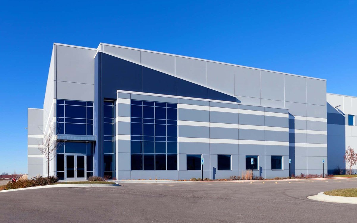
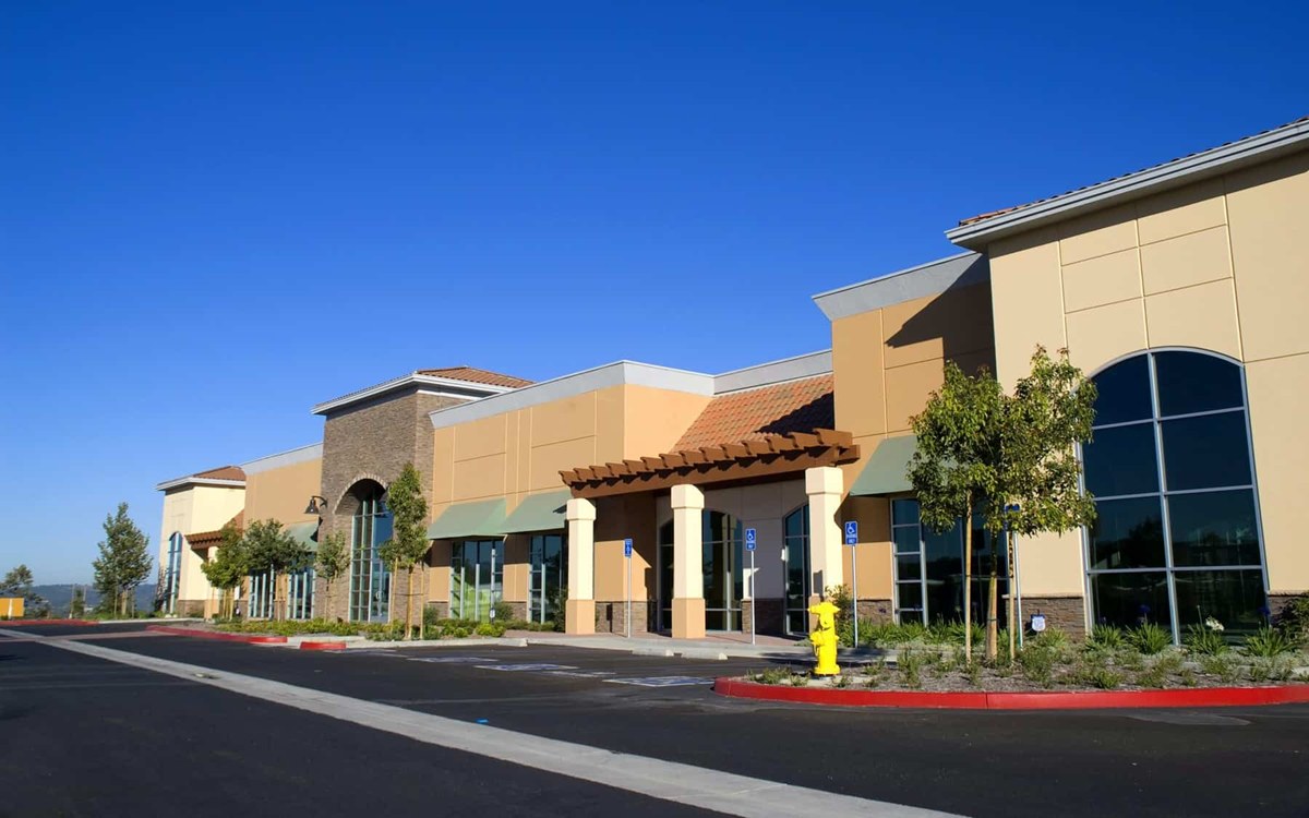
If you’re planning an exterior commercial painting project, you may be wondering how to choose colors that feel professional and eye-catching. When it comes to curb appeal, the best neutral paint colors for commercial buildings are those that blend timeless style with a subtle edge. Choosing the right palette not only helps attract customers but also communicates trust and professionalism.
Key Takeaways:
- Neutral colors can still make a bold impression
- The right exterior colors enhance brand perception
- Consider building material, architecture, and surroundings
- Lighter tones can make buildings appear larger and more inviting
- Darker neutrals add a sleek, modern touch

Why Neutrals Work for Commercial Exteriors
Neutral colors are a popular choice for commercial buildings for good reason. They convey stability, cleanliness, and versatility. More importantly, they appeal to a wide range of tastes, which is essential when your building serves as a public-facing brand statement.
When done right, neutral doesn’t mean boring. Think soft charcoals, warm taupes, creamy off-whites, and even subdued greens or blues. These hues can complement a variety of materials like brick, stone, stucco, or metal.
Factors to Consider Before Choosing a Neutral
Before committing to a color, consider these key elements:
1. Surroundings
Your building doesn’t exist in a vacuum. Look around at nearby structures, landscape elements, and even the sky. You want a neutral that fits in while still standing out just enough.
2. Building Materials
Some colors look better on certain materials. A soft gray might look sleek on metal siding but fall flat on textured stucco. Always test colors in small patches before committing.
3. Lighting Conditions
Natural lighting affects how a color appears at different times of day. A color that seems soft beige in the morning may appear almost yellow at dusk.
4. Brand Identity
Your building should reflect your brand’s personality. A law firm might go for navy-tinged gray, while a spa might lean toward warmer, soothing neutrals.

The Best Neutral Paint Colors for Commercial Buildings
Here are some of the top-performing neutral colors for exterior commercial painting projects:
1. Repose Gray (Sherwin-Williams)
A true classic that balances warm and cool tones. It’s professional without being sterile, making it an ideal choice for office buildings, financial institutions, or any business that wants a polished, dependable look. It pairs especially well with stone accents and metallic finishes.
2. Accessible Beige (Sherwin-Williams)
A warm, welcoming beige that works especially well for healthcare offices and hospitality settings. Its subtle undertones bring softness to a building’s facade, creating a comforting and approachable appearance that’s perfect for client-facing businesses.
3. Urbane Bronze (Sherwin-Williams)
This dark, earthy neutral brings a contemporary feel—great for modern retail or industrial buildings. Urbane Bronze stands out against lighter surroundings and adds a grounded, sophisticated touch. It works beautifully with wood, concrete, and steel elements.
4. Mindful Gray (Sherwin-Williams)
A soft, adaptable gray that plays well with natural and urban surroundings. It transitions effortlessly between warm and cool light, making it a versatile option for buildings in areas with changing daylight conditions. It’s great for retail storefronts or office parks.
5. Alabaster (Sherwin-Williams)
Bright but not stark. Alabaster gives your building a clean, upscale vibe without being too white. It reflects light well, making buildings appear more spacious and inviting. It’s a strong pick for spas, salons, and modern boutique spaces.
6. Edgecomb Gray (Benjamin Moore)
A subtle, warm gray that pairs beautifully with stone and brick facades. This color adds softness and warmth without losing that neutral appeal, making it ideal for professional spaces like medical centers or law offices.
7. Chelsea Gray (Benjamin Moore)
Sophisticated and bold, Chelsea Gray is ideal for buildings that want a bit more presence without going too dark. Its depth and elegance are a great match for upscale retail locations, restaurants, or historic commercial buildings with character.
Pro Tips for a Polished Look
- Accent with purpose. Use deeper or contrasting neutrals for trim, awnings, or doors to add depth and dimension to your building’s exterior. Thoughtful accenting helps guide the eye to entrances or signage and can give an otherwise plain facade a high-end, custom feel.
- Don’t skip prep. A smooth, well-prepped surface makes any paint job look better and last longer. Proper cleaning, repairing cracks or damage, and applying primer are crucial steps that ensure paint adheres evenly and maintains its finish over time.
- Invest in quality. Higher-end exterior paints resist fading, cracking, and mildew—crucial for long-term curb appeal and protection from the elements. Investing in quality products up front can save you time and money on future maintenance and repainting.
Need Help Picking the Perfect Color?
Choosing the best neutral paint colors for commercial buildings can be overwhelming, but you don’t have to figure it out alone. At Woodiwiss Painting, we specialize in exterior commercial painting that makes your business stand out for all the right reasons. Whether you’re refreshing your storefront or preparing for a full rebrand, our experts are ready to guide you to the perfect color solution.
Call us today at 925-489-0941 to schedule your free consultation and discover how the right paint can elevate your property—and your brand.


