Choosing the right shades for your interior painting project can feel overwhelming, especially when you’re dealing with an open-concept space. But if you’re wondering about the best paint colors for open floor plans, you’re in the right place.
In open-concept homes, colors do more than decorate walls — they help define spaces, influence mood, and create flow. With fewer walls to separate rooms, picking the right palette can tie everything together beautifully while still giving each area its own vibe. Let’s dive into how you can make smart color choices for your open floor plan without sacrificing personality or cohesion.
Key Takeaways:
- Use color to create flow and distinguish functional zones.
- Stick to a cohesive palette with strategic contrast.
- Neutrals, soft earth tones, and muted shades work best.
- Use accent walls or bold hues sparingly.
- Test colors in different lighting before committing.

Why Color Choice Matters in Open-Concept Layouts
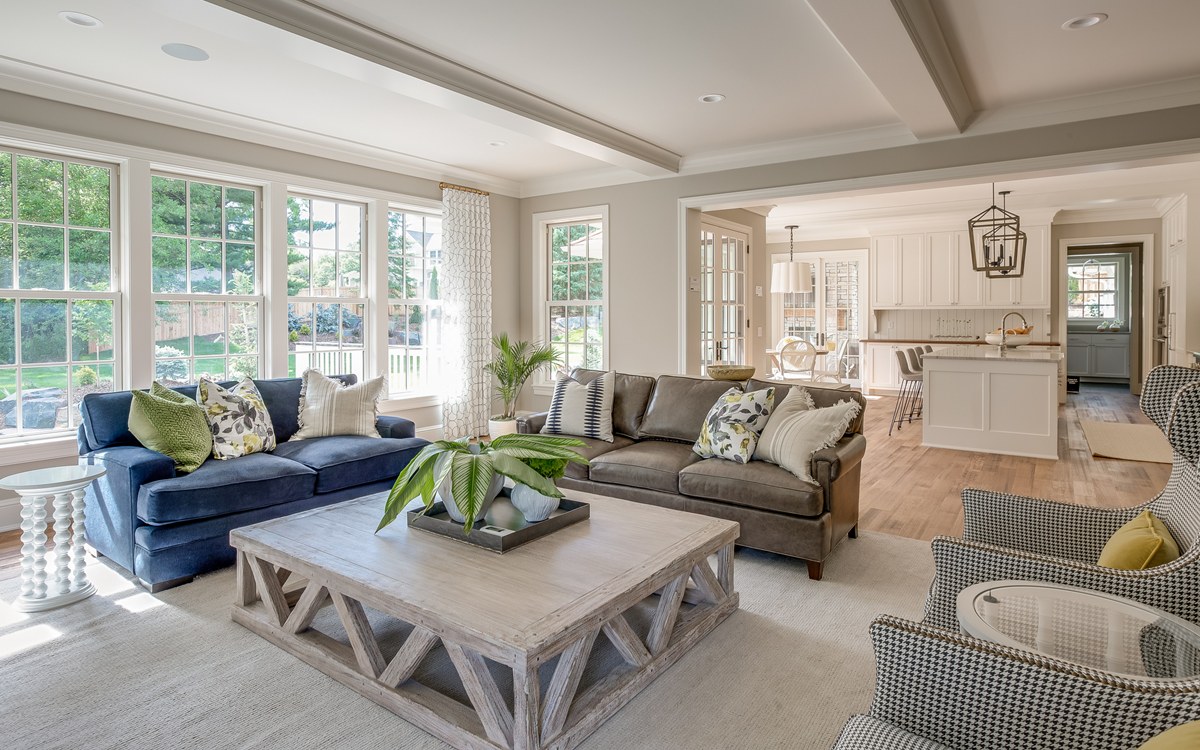
Open-concept living brings light, airiness, and a modern feel to your home. But it also presents unique challenges when it comes to paint. With fewer physical boundaries, color needs to play double-duty: visually connecting your living, dining, and kitchen areas, while still giving each zone its own identity.
A good rule of thumb? Keep your base color consistent throughout the space, and then use complementary tones or subtle shifts to define different areas. This keeps everything feeling intentional and easy on the eyes.
Top Picks: Best Paint Colors for Open Floor Plans
So, what are the best paint colors for open floor plans? Here are some tried-and-true winners:
1. Warm Whites and Soft Beiges
These timeless neutrals are perfect for making your space feel bright, clean, and unified. Look for shades like Benjamin Moore’s “White Dove” or Sherwin-Williams’ “Alabaster.”
2. Greige (Gray + Beige)
Greige tones are popular because they combine the best of both worlds — the warmth of beige and the cool sophistication of gray. They work wonderfully in open spaces and pair well with wood floors, stone, and metal accents.
3. Muted Blues and Greens
If you want a bit of color without overwhelming your space, muted tones like dusty blue or sage green bring calm energy and pair well with natural elements.
4. Soft Earth Tones
Colors like clay, sand, or terracotta add subtle warmth and work beautifully in open-concept homes with a boho or organic style.
5. Charcoal or Navy Accents
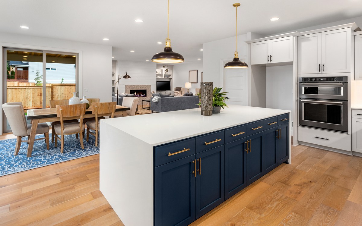
You don’t have to go all-in on bold shades, but adding a charcoal or navy accent wall can ground your space and make it feel more anchored.
How to Create Color Flow Without Going Monotone
One of the biggest challenges in open spaces is choosing colors that feel coordinated but not boring. Here’s how:
- Pick a primary wall color that works in all lighting conditions — natural daylight, artificial light, and everything in between. This should be a shade you love and can live with across a large space, as it will act as the visual anchor for your open-concept layout.
- Use color progression: Start with a base tone, then subtly vary the hue by going slightly lighter or darker as you move from one zone to the next. This technique keeps things interesting while maintaining cohesion, especially useful for subtly differentiating spaces like dining from living areas.
- Repeat accent colors in decor like throw pillows, rugs, curtains, or artwork to visually connect different areas of your open floor plan. Repeating the same navy blue or deep green in different parts of the space helps establish harmony and makes the design feel intentional.
- Consider undertones: Make sure all your paint choices have similar undertones — whether cool (like blue or purple) or warm (like yellow or red). Clashing undertones can make your space feel off, even if the colors seem neutral or subdued at first glance.

Lighting: The Secret Ingredient to Paint Perfection
Natural light, overhead fixtures, and even your furniture can impact how a color looks. Always test paint swatches on your walls and observe them throughout the day before committing. Lighting can make a soft gray appear blue or a beige look pink — and that’s not something you want to discover after painting.
What Not to Do in an Open-Concept Paint Plan
- Don’t use completely different colors in each zone — it can look disjointed and cluttered. Instead, aim for subtle transitions and shared tones that maintain a sense of unity across the space.
- Avoid high-contrast transitions unless you’re doing it very intentionally (like for an accent wall). Too much contrast between adjoining areas can break the visual flow and make the layout feel jarring.
- Skip overly bright or saturated colors unless they serve a specific design purpose. Loud colors can dominate an open area quickly and distract from the overall harmony of the space. Use them strategically as accents rather than main wall colors.
Final Thoughts
Choosing the best paint colors for open floor plans doesn’t have to be stressful. With a little planning and a good understanding of your space and lighting, you can create a seamless, stylish look that works from kitchen to couch.
Ready to kick off your interior painting project with confidence? Contact Woodiwiss Painting today at 925-489-0941 for expert color consultations, professional painting services, and everything you need to make your open-concept space shine.


